Everything is connected.
As part of my work with the Ecocitizen World Map project (EWM) I’m currently learning about Urban Metabolism Information Systems (UMIS), a whole systems analysis that measures everything flowing into and out of a city over time and space. The UMIS methodology was developed by Dr. Sebastian Moffatt and proposes a standardized “source to sink” framework to better understand and analyze urban systems as they process through the built environment. For example, here’s a close-up of just one segment of the City of Vancouver, BC’s water flow, showing how water is used and where it goes after that.
In fact, with the help of intrepid citizen activists and students in our pilot cities of Cairo and Casablanca we are taking it even further: turning the tool from the inside out and from the bottom up, we are testing out Participatory Urban Metabolism Information Systems, a method designed to empower people on the ground to map out their own neighborhoods and become participants in transforming their communities into more resilient, equitable, and ecologically healthy settlements.
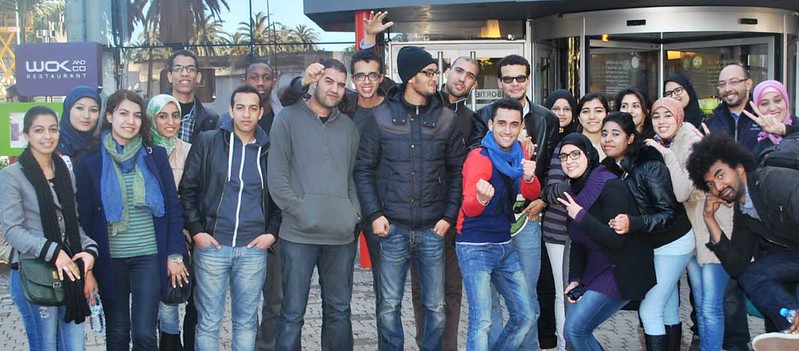
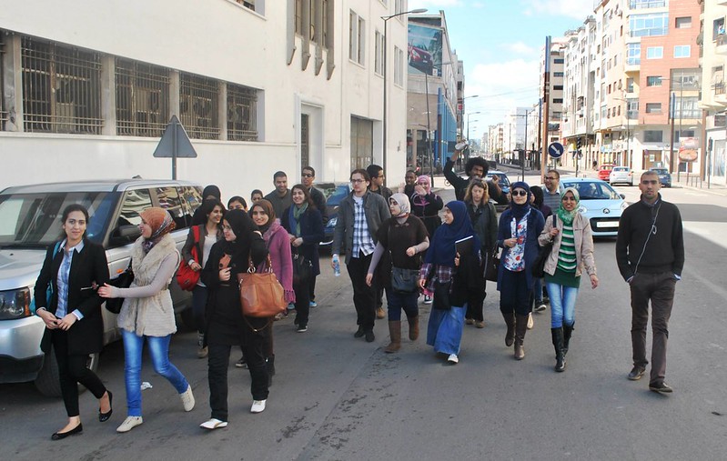
Community activists and students at Mundiapolis University in Casablanca getting ready to map out the neighborhood of Roches Noires.
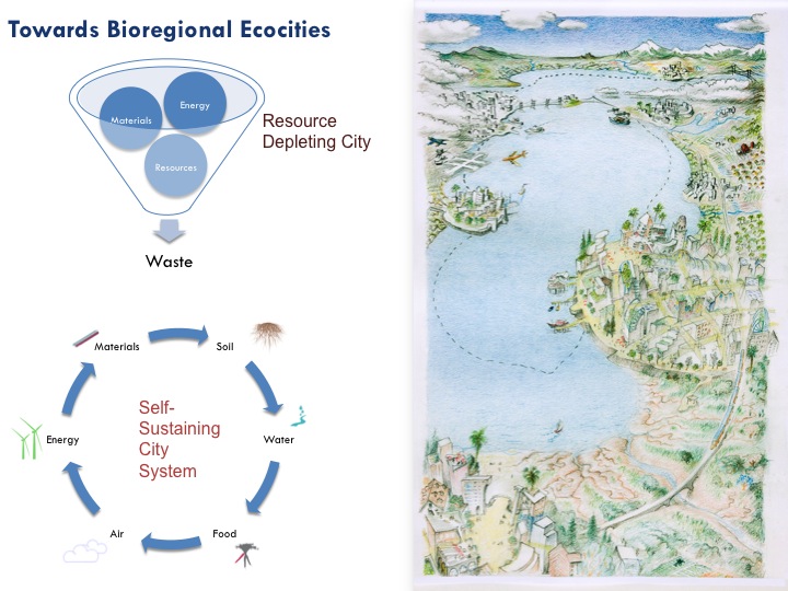
Why is this important? Well, like a human body a city is a living, ever-evolving organism, and in order to have it operate at a healthy level and in sync with its environment you have to know exactly what flows into it, how those things are used, and where they go after the body no longer needs them. Another familiar analogy to think of is a Life Cycle Analysis (LCA), the well established method to assess environmental impacts associated with all the stages of a product’s life, from cradle to grave. But LCAs only work for products, and cities and neighborhoods aren’t products — they are situated in one place, they are complex, ever-changing physical and cultural ecosystems, and they have no lifetime. Cities are eternal.
Cities are also the largest things that humans build, and with the number of cities of 750,000+ inhabitants quadrupling over the last 50 years and 70 percent of the world’s population projected to live in urban areas by 2050, the quest to figure out how our urban environments could operate within the earth’s carrying capacity ranks as one of the most viable pursuits anyone concerned about climate change, resource depletion, loss of biodiversity, and the human struggles associated with it could undertake. To put it simply, if we don’t understand our cities’ organisms, we will never be able to have them function in balance with the larger natural organisms within which they reside.
The Urban Metabolism
Urban metabolism as a concept is not entirely new. In fact, back in the 19th century, Karl Marx and Friedrich Engels recognized that human activity alters the biophysical processes by analyzing the dynamic internal relationships between humans and nature. Unfortunately, most of the intellectual heavyweights since then have been busy thinking about economy in terms of how quickly and efficiently we can extract, produce, consume, and trash the planet’s natural treasures without regard to the shortsightedness of such an approach.
It wasn’t until over a hundred years later that a more holistic assessment of a city’s anatomy was formally developed for the first time. In a 2007 paper entitled “The Changing Metabolism of Cities,” Christopher Kennedy and a team of civil engineers from the University of Toronto defined urban metabolism as “the sum total of the technical and socio-economic process that occur in cities, resulting in growth, production of energy and elimination of waste.”
However, up until very recently this was mostly a theoretical exercise, albeit an important one. It’s a big step for the western industrial mindset used to externalizing (i.e. ignoring) any costs outside of narrow short-term benefits within a limited area and for a very targeted group of recipients to come to a whole systems understanding of the world in which everything is interdependent and nothing ever goes “away.” To be sure, the reality of dwindling fossil fuels and melting ice caps is no longer affording us the luxury of one-dimensional thinking if we’re planning on sticking around for a while.
Whatever the motivation, the benefits of treating urban environments in such holistic fashion are similar in nature to being tuned in to the rhythm of our bodies — the more we know about the effects of different components like diet, exercise, sleep, or laughter on our physical and emotional well being, the more likely we are to live balanced and healthy lives. Figuring out the intricacies of our bodies is tricky enough, but how do we analyze something as complex as a modern industrial city, with all its physical and cultural microcosms, its ever-shifting flows of people, ideas, buildings, and materials?
Well, if we had a platform that could organize and visualize the data of the various in- and outputs of a city — food, water, energy, transportation, etc — and the conversions that happen between, you’d get an honest picture of where in the system most of the waste, pollution, and externalizations occur and which adjustments or loops might produce a more streamlined, efficient, and ecologically healthy process.
Urban Metabolism Information Systems (UMIS)
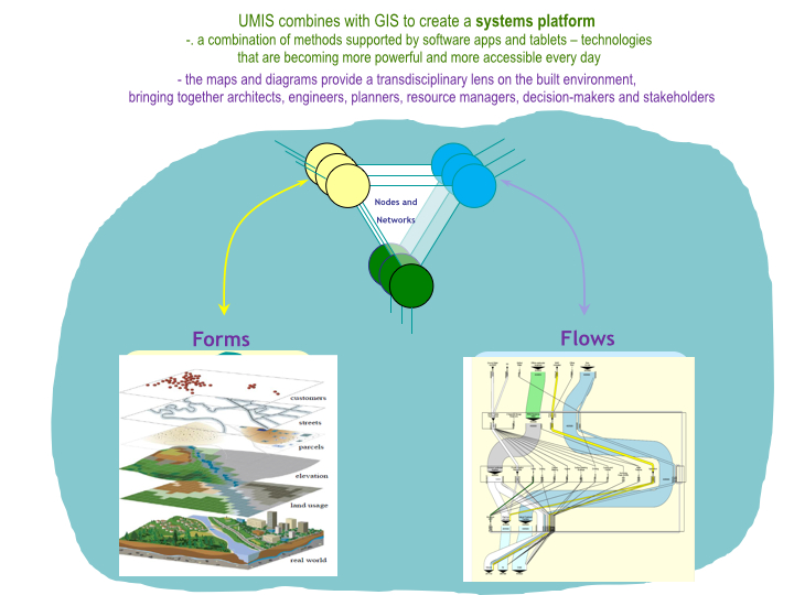
Sebastian has been thinking about how to create this kind of whole systems analysis that can draw a picture of where everything is coming from and where it’s going to for a while. The first planner in modern times to develop long-term sustainability plans for cities that integrate resiliency as a key theme, he has taken the urban metabolism field to a new level by creating the tools to estimate the flows of energy, water and materials through cities and illustrate them in a simple and standardized way.
The key to this tracking and visualization of the material flow that constitutes an urban metabolism are meta diagrams. Based on a Sankey diagram, a flow diagram named after an Irish Captain who came up with it in 1898, meta diagrams put visual emphasis on the major transfers or flows within a system, with the width of the arrows shown proportionally to the flow quantity. They are most commonly used to visualize the energy or material flow accounts on a regional or national level (the US Energy Information Agency uses them for their annual report), but they can be used any time you have a number of different sources, distributions, and outputs.
For example, here’s a simple and fun meta diagram that illustrates Cincinnati College Conservatory of Music’s recital distribution diagram from January to April 2014.
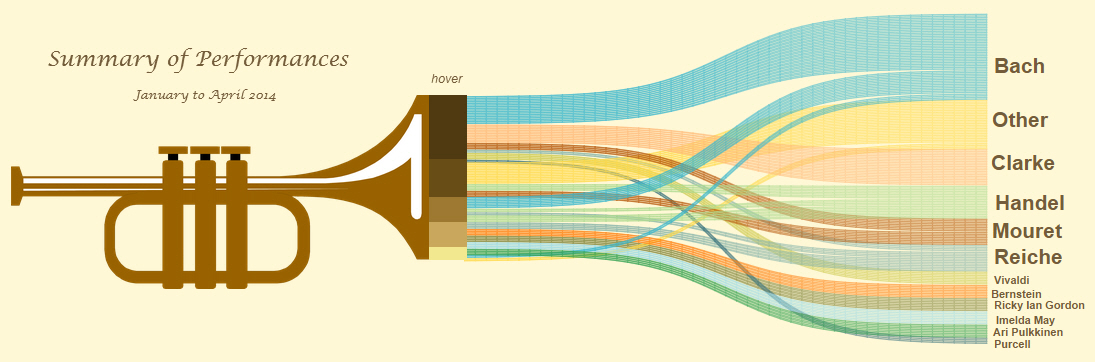
From Steve Wexler’s blog ‘Data Revelations’ on Sankey diagrams: Music Major, Data Miner.
The shades of brown describe the various types of recitals as the source (hover at this link to see weddings, church services, school recitals, funerals, etc), the composers as the outcome, and the thin and thick waves between them as the distribution. Turns out they played Bach at weddings, concerts and funerals, but not at church services and recitals.
Not surprisingly, it gets more complex than that. Sebastian delved into the development of what he calls MetaFlow diagrams for entire urban systems as part of the Eco2 Cities: Ecological Cities as Economic Cities project (published in 2010), an analytical and operational framework that offers strategic guidance to cities on sustainable and integrated urban development. Seeking to offer ground-level perspective, they conducted case-studies in cities across Asia that would help to showcase the cities’ current flow and offer insights on how these flows could be better looped in order to avoid so much waste and leakage.
A MetaFlow diagram of the energy system of Jinze, Shanghai, for example, shows the discrepancy between the current system (left) and a scenario for an advanced system (right).
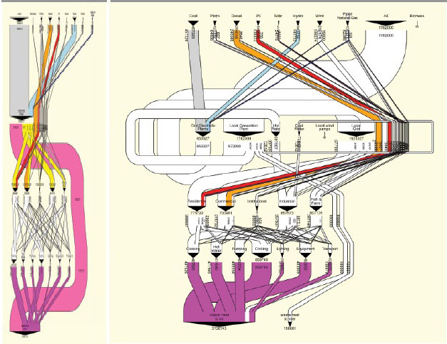
Source: Author elaboration (Sebastian Moffatt) with approximate data provided by Professor Jinsheng Li, Tongii University, Shanghai.
In the current system, energy pretty much goes straight from source to consumption to sink, with very little capturing, reuse, or conservation happening in between. It’s a bit like heating your house with all the windows open — it may achieve the goal of keeping you warm, but the price in energy, pollution, and money to do so is huge. On the other hand, the MetaFlow diagram on the right with all the cascading lines provides a scenario for an advanced system that helps reduce emissions and costs and increases local jobs and energy security. In this example, a local electricity generation facility is powered by liquified natural gas and provides a majority of the electricity needs as well as hot and cool water for industry.
If you think of it like an onion, with things going in at the top and coming out at the bottom, then the fatter and more twirly the middle the more efficiently a city is using its resources and the closer to being resilient and ecologically balanced it is getting. To put it in “body language” terms, the more diversified, fresh, and nutritious your diet, the smaller the portions you need, the better you feel, the healthier your soils, and the less fossil fuels needed to produce your food.
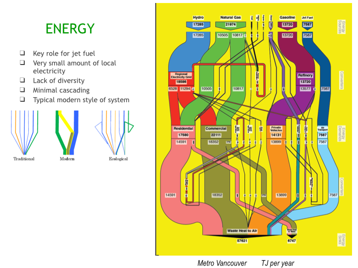
Recently, one of Sebastian’s colleagues, Director Dr. Philip Mansfield of Graphical Memes did a number of MetaFlow diagrams for the City of Vancouver B.C., with data provided from Jennie Moore, the Director of Sustainable Development and Environmental Stewardship at BCIT. The energy diagram shows a very typical modern centralized system, with small amounts of locally sourced electricity, not much energy diversity, and minimal cascading (very little efficiency, recycling, or dual use). Basically, most of Vancouver’s energy comes from non-renewable sources (except hydro) and ends up in the air after being used for a single purpose at a single time.
Speaking of body language, here’s a MetaFlow diagram for food, which I think is worth zooming in a bit.
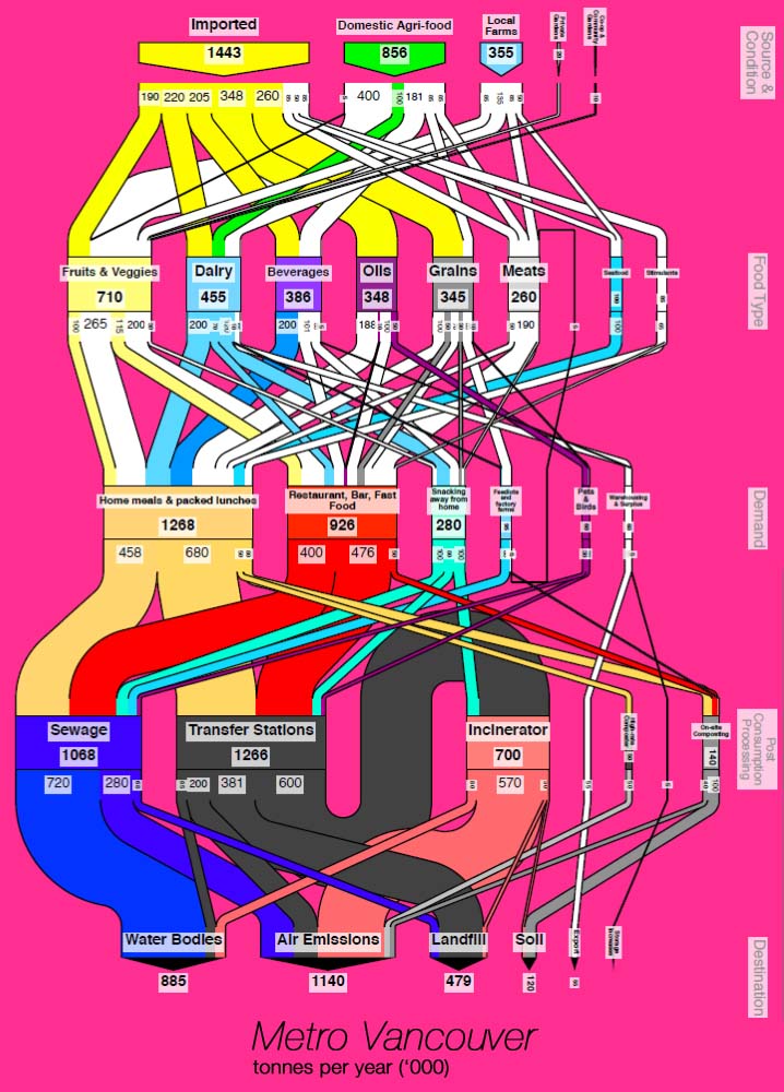
As you can see, there’s a lot more cascading at the top, which is partly because there are more diverse food-types than energy-types, with local farms supplying a visible share of different foods. Fruits and veggies are a substantial amount of the total organic material flow. On the other end though you can see how the sinks are much less textured, with most of Vancouver’s food waste (which typically represents about 50% of the entire waste stream) going to transfer stations and incinerators, from where it’s going to landfill or is released into the air. Many strategies could be considered for looping and cascading these flows, that is, to create a more connected food web within the city. For example, if food waste is composted as soil, the soil can be used locally for farming or landscaping and the city has less need for hauling material by truck and acquiring land for landfill.
As Sebastian likes to point out, these diagrams are worth a thousand pie charts. But this is not all of it. What if you could drill deeper into the metabolism of a city by looking at each neighborhood, everything it needs to stay alive, and all it disposes? The data you get from official sources usually is very static and general. A utility company can only tell you how many gallons of water the entire city consumes per year, but it doesn’t tell you how much of it goes to toilets, laundry, or showers, or how usage varies from neighborhood to neighborhood. This makes it hard to adopt relevant conservation or catchment strategies.
This is where the on-the-ground crowd-mapping tools and initiatives of the Ecocitizen World Map Project come in.
Participatory Urban Metabolism Information Systems (PUMIS)
Mundiapolis University students and community members on their way to surveying residents of Casablanca’s Roches Noires neighborhood.
The premise of the Ecocitizen World Map Project is that if we all take coordinated actions towards a shared vision of a sustainable and equitable urban environment we can address even the most serious problems facing the planet and its inhabitants. As citizens of living urban organisms it’s only logical that we would be active participants in the maintenance and evolution of the intricate webs that sustain us, and we each bring a unique set of knowledge and sensitivity to our local physical and cultural micro-organisms.
The fact that currently the MetaFlow diagrams of most cities in the world would look similar to Vancouver’s — with very unbending and centralized flows that leave little room for localized and adaptable ways to make better use of both natural and human resources — shows that there’s a real need for tools that enable communities to better understand their own neighborhoods and identify the areas where more looping and cascading could be applied as systems become more ecological. If we’re serious about sustainability, we have to do an honest audit of our cities from the inside out instead of the current superficial top-down assessments that all too often falsely proclaim cities with gigantic ecological footprints to be sustainable.
Consequently, if we want to find out how the resources and materials that flow through an urban ecosystem are being used and distributed within that ecosystem, we have to survey residents about how they’re using those resources. And that’s exactly what we did in our pilot cities Cairo and Casablanca.
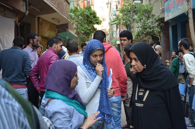
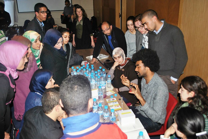
Conducting citizen surveys and parcel audits in Cairo’s Imbaba neighborhood.
Going into neighborhoods and getting all kinds of local information is not only great because you get a lot of previously unknown data, but it makes residents curious about things they may not have thought of before, giving them incentive to become involved in finding solutions to problems that may exist. For example, in Casablanca, water samples that participants in our “bootcamps” took in the Roches Noires neighborhood turned out to be not as clean as the city claims, which led to further questions about the water cycle and a dialog between residents and the utility company.
Ecocitizens testing water from Roches Noires, Casablanca.
Water is a very precious and expensive resource in communities like Roches Noires and Imbaba, so finding out where waste occurs and how you could loop more gray water, for example, is really meaningful. Organizing the data from the surveys into an easily understandable format is key. This is where grassroots citizen participation meets MetaFlow.
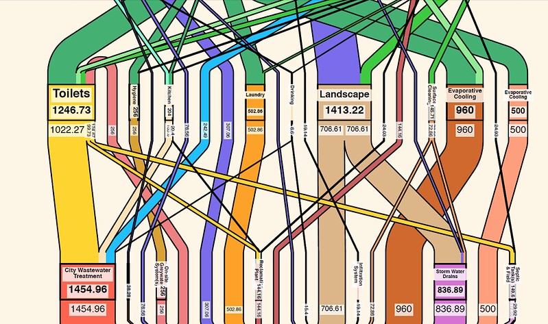
Let’s look at the water that flows through the building at 4 Sharaf Allet in Imbaba and its corresponding diagram that you can find on the interactive ecocitizen map on our Cairo pilot page.
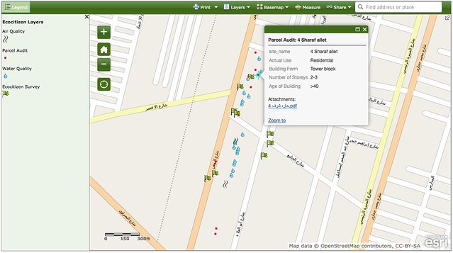
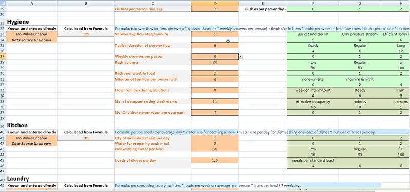
After learning to use the UMIS data templates, the citizen surveyors can customize the templates according to archetypes that represent parcels with similar structures and characteristics. This way a lot of the values that may be the same in similar structures can be set as default. For example, the template for a UMIS water survey may look something like this.
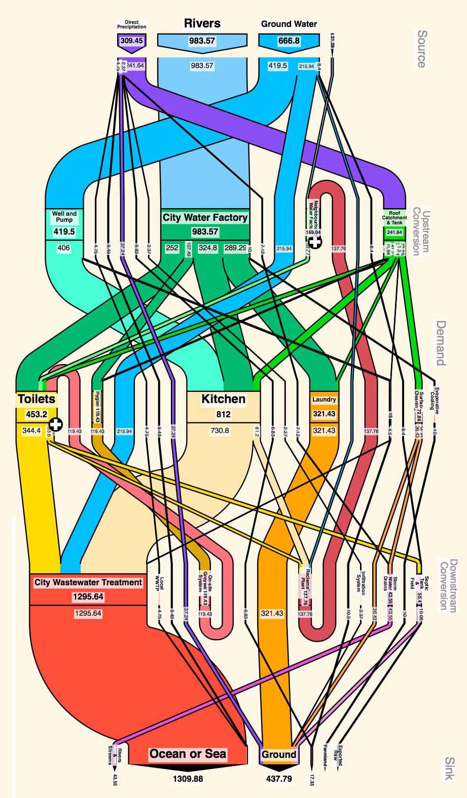
Once you’ve completed the survey you can create a MetaFlow diagram for just that parcel as it relates to the city’s sources, conversions, and sinks. It’s pretty cool to see it in detail.
You can see that all the water used for hygiene (shower/bath) comprises just a very small part of overall water use, but is looped back into the toilets through an onsite greywater system. At the same time, water from the kitchen which comprises the lion’s share of water use at 4 Sharaf Allet is for the most part going straight to the city’s wastewater treatment on its way to the ocean. However, a small amount is reclaimed and goes to a neighborhood water facility. Residents may ask themselves whether it would be possible to recycle more of the water that flows through their kitchens.
This, of course, is very specific data, but analyzing these localized metabolisms leads to the patterns and trends necessary to make specific adjustments on a larger scale. Just as in any sampling or polling, you have to survey just enough people or units to get a meaningful representation of a larger population or neighborhood.
In the case of the UMIS system, it is set up with a structure designed to permit easy aggregation of the parcel-scale urban metabolisms. Once separated according to archetype, the parcels can be averaged, multiplied by the population they represent, and then summed with other archetypes. In other words, the audited parcels can be used to generate accurate and precise estimates of all the systemic flows for different combinations of parcels, or for the neighborhood as a whole.
Once we get these kinds of citizen-generated reports based on real-life conditions and structured around a holistic framework, the patterns that emerge allow for both residents and planners to ask the kind of questions that can lead to both local and regional ecological improvements. What could we do for people to get by on rainwater? How could the city avoid leakage in their water and energy systems?. How do we stay within the carrying capacity?
Or as Sebastian likes to say, “we can use these diagrams to tell the story of where we want to go and why!”